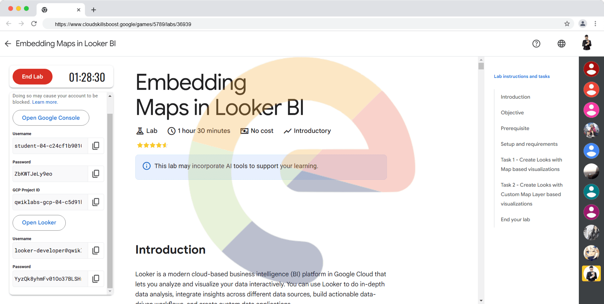
Looker is a modern cloud-based business intelligence (BI) platform in Google Cloud that lets you analyze and visualize your data interactively. You can use Looker to do in-depth data analysis, integrate insights across different data sources, build actionable data-driven workflows, and create custom data applications.
Looker provides business teams the ability to analyze supply chains, market digitally, quantify customer value, decipher customer behavior, and evaluate distribution processes. The dashboards allow presenting data and insights using customizable charts, graphs and reports. All dashboards and queries can be drilled into, so users can discover information in multiple layers. Looks and dashboards are the two major building blocks in Looker. This document walks you through the steps involved in creating looks with the inbuilt map based visualizations and also by adding a custom map layer.
The objective of this document is to describe and demonstrate how maps based visualizations can be created in Looker. This document provides a step by step detailed guide on how to add the inbuilt map based visualizations and also adding a custom map layer based on TopoJSON data in Looker.
For using Google Maps visualization instead of Map(Legacy) ensure that the below feature is enabled.
‘The New Explore Visualizations Labs feature, which should be enabled by default. This is under admin--> general --> labs --> toggle button for New Explore Visualizations’
For each lab, you get a new Google Cloud project and set of resources for a fixed time at no cost.
If you use other credentials, you
7. Accept the terms and skip the recovery resource page.
Do not click End Lab unless you are finished with the lab or want to restart it. This clears your work and removes the project.
Read these instructions. Labs are timed and you cannot pause them. The timer, which starts when you click Start Lab , shows how long lab resources will be made available to you.
This Qwiklabs hands-on lab lets you do the lab activities yourself in a real cloud environment, not in a simulation or demo environment. It does so by giving you new, temporary credentials that you use to sign in and access Looker for the duration of the lab.
What you need To complete this lab, you need:
When ready, click .
A new panel will appear with the temporary credentials that you must use for this lab.
If you need to pay for the lab, a pop-up will open for you to select your payment method.
Note your lab credentials. You will use them to sign in to the Looker instance for this lab.
If you use other credentials, you will get errors or incur charges .
Click Open Looker .
Enter the provided Username and Password in the Email and Password fields.
Important: You must use the credentials from the Connection Details panel on this page. Do not use your Qwiklabs credentials. If you have your own Looker account, do not use it for this lab.
Click Log In .
After a successful login, you will see the Looker instance for this lab.
Task 1 - Create Looks with Map based visualizations Look #1- Choropleth Map: Plot carriers operating count by state on Maps
In this section, you will need to use the Airports dataset to build a visualization that answers the following question represented on a choropleth map: How many carriers operate for each state?
In the Looker Navigation menu , click Explore .
Under FAA , click Flights .
The available dimensions and measures will be listed in the data panel for Flights.
Under Carriers > Measures , click Count .
Under Aircraft Origin > Dimensions , select State .
Click Run .
Click the arrow next to Visualization to expand the window.
Once the Visualization window has expanded, Choose the Map Visualization.
A map should appear with US states.
Click on edit option. Go to the value tab. Toggle the reverse color scale option.
The map visualization should appear as below.
Notice the tooltip by taking the cursor to a state.
Save this visualization as a dashboard. Click on settings icon and then click on save as a new dashboard .
Title the Dashboard as Carriers count against states .
Click Check my progress to verify the objective.
Create Looks with Map based visualizations
Check my progress
Look #2 - Map with Lines: Count of Flights connecting a state
In this section, you will need to use the Airports dataset to build a visualization that answers the following question represented on a map: How many flights originating from Atlanta, GA got delayed?
In the Looker Navigation menu , click Explore .
Under the FAA , click Flights .
The available dimensions and measures will be listed in the data panel for Flights.
Click on the top left burger Main menu , enable Development Mode .
On the top bar you should see message: You are in Development Mode .
Go to Bottom left of the window and click on Go to LookML .
It will open an another window.
Go to File Browser > qwiklabs-flights-maps.model.lkml , and verify that map_location is available under aircraft_destination fields
Go back to Explore from the main burger menu from the top left.
Under Flights > Measures , click Count .
Under Aircraft Origin > Dimensions , select Map Location .
Under Aircraft Destination > Dimensions , select Map Location .
Click Run and see the map in visualization then follow filter steps
Now, Add filters on the left pane.
a. Aircraft Origin > Dimensions > City Click on the Filter by Field .
i. Enter ATLANTA in the box, keep the condition as is equal to .
b. Flights Details > Dimensions > Arrival Date > Year , Click on the Filter by Field .
i. Enter 2004 in the box, keep the condition as is in the year .
c. Aircraft Destination > Dimensions > State , Click on the Filter by Field .
i. Enter CA, WA, CO, NV, UT, AK, HI, OR, LA, ID, WY in the box, keep the condition as is equal to .
Applied filters should look like this in the Filters pane
Click Run .
Click the arrow next to Visualization to expand the window.
Click the Map option on the visualization pane. A map should appear with US states.
Click on the edit option. Go to the Plot tab. Check the connect with lines option.
On the edit option, go to the Points tab. Select Type as Icon and Icon as Airplane .
The map visualization should appear as shown below.
Notice the tooltip by taking the cursor to an icon.
Save this visualization as a dashboard. Click on settings icon and then click on save as a new dashboard .
Title the Dashboard as Delayed flights count originating from Atlanta, GA .
Click Check my progress to verify the objective.
Map with Lines Count of Flights connecting a state
Check my progress
Task 2 - Create Looks with Custom Map Layer based visualizations In this section, you will need to use the Aircraft dataset to build a visualization that answers the following question represented on a custom layer map : Compare airport counts at West and Midwest region level.
In the Looker Navigation menu , click Explore .
Under the FAA , click Flights .The available dimensions and measures will be listed in the data panel for Flights.
On the left pane, click on Go to LookML link(at the bottom).
The file browser is opened.
Check the file is seen under the maps folder.
Click on the qwiklabs-flights-maps.model file. You should be able to see the underlying LookML code.
Create a map layer representing the West and Midwest regions. Add the below snippet.
map_layer : data_area {
file : "maps/US_West_Midwest.topojson"
}
Copied!content_copy
Save the changes.
This adds the new map layer with name as data_area .
Now, create a dimension in the view, click on aircraft.view and remove the region filter as shown in below image.
Now add the below code snippet in this view.
dimension : region {
type : string
case : {
when : {
sql : ${state} in ('WA','OR','CA','NV','UT','WY','ID','MT','CO','AK','HI') ;;
label : "West"
}
when : {
sql : ${state} in ('AZ','NM','TX','OK') ;;
label : "Southwest"
}
when : {
sql : ${state} in ('ND','SD','MN','IA','WI','MN','OH','IN','MO','NE','KS','MI','IL') ;;
label : "Midwest"
}
when : {
sql : ${state} in ('MD','DE','NJ','CT','RI','MA','NH','PA','NY','VT','ME','DC') ;;
label : "Northeast"
}
when : {
sql : ${state} in ('AR','LA','MS','AL','GA','FL','SC','NC','VA','TN','KY','WV') ;;
label : "Southeast"
}
else : "Unknown"
}
map_layer_name : data_area
drill_fields : [state]
}
Copied!content_copy
Notice the map_layer_name is data_area . Also, it enables you to set drill fields, region to state, city.
Save the changes.
Click Explore .
Under the FAA , click Flights .
On the left pane, Under Aircraft > Dimensions , select Region .
Under Aircraft > Measures , select Count .
Click Run .
Click the arrow next to Visualization to expand the window.
Once the Visualization window has expanded, Choose the Map Visualization.
Click the Map option. A map should appear with US states showing two regions West and Midwest .
Save this visualization as a dashboard. Click on settings and then save as a new dashboard .
Title the Dashboard as Airport counts for West and Midwest regions in US .
Click Check my progress to verify the objective.
Create Looks with Custom Map Layer based visualizations
Check my progress
24. Dashboard shows the look with the aircraft's count in West and Midwest Regions.
Click on one of the regions and then click on state to drill down.
State level aircraft count is shown.
Notice the option to download the visualization.
Close the window.
Click on table option to switch to tabular view.
The related results are available for download.
Solution of Lab
qwiklabs-flights-maps.model
connection : "bigquery_public_data_looker"
include : "*.view"
include : "/z_tests/*.lkml"
map_layer : data_area {
file : "maps/US_West_Midwest.topojson"
}
explore : airports {
group_label : "FAA"
}
explore : flights {
group_label : "FAA"
description : "Start here for information about flights!"
join : carriers {
type : left_outer
sql_on : ${flights.carrier} = ${carriers.code} ;;
relationship : many_to_one
}
join : aircraft {
type : left_outer
sql_on : ${flights.tail_num} = ${aircraft.tail_num} ;;
relationship : many_to_one
}
join : aircraft_origin {
from : airports
type : left_outer
sql_on : ${flights.origin} = ${aircraft_origin.code} ;;
relationship : many_to_one
fields : [full_name, city, state, code, map_location]
}
join : aircraft_destination {
from : airports
type : left_outer
sql_on : ${flights.destination} = ${aircraft_destination.code} ;;
relationship : many_to_one
fields : [full_name, city, state, code, map_location]
}
join : aircraft_models {
sql_on : ${aircraft.aircraft_model_code} = ${aircraft_models.aircraft_model_code} ;;
relationship : many_to_one
}
}
explore : +flights {
query : quicklab_task_1 {
dimensions : [aircraft_origin.state]
measures : [carriers.count]
}
}
explore : +flights {
query : quicklab_task_2 {
dimensions : [aircraft_destination.map_location, aircraft_origin.map_location]
measures : [count]
filters : [
aircraft_destination.state: "CA,WA,CO,NV,UT,AK,HI,OR,LA,ID,WY",
aircraft_origin.city: "ATLANTA^ ^ ^ ^ ^ ^ ^ ^ ^ ^ ^ ^ ^ ^ ^ ^ ^ ^ ^ ^ ^ ^ ^ ^ ",
flights.arrival_year: "2004"
]
}
}
explore : +flights {
query : quicklab_task_3 {
dimensions : [aircraft.region]
measures : [aircraft.count]
}
}
aircraft.view
view : aircraft {
sql_table_name : `cloud-training-demos.looker_flights.aircraft` ;;
dimension : tail_num {
type : string
primary_key : yes
sql : rtrim(${TABLE} .tail_num) ;;
}
dimension : address1 {
type : string
sql : ${TABLE} .address1 ;;
}
dimension : address2 {
type : string
sql : ${TABLE} .address2 ;;
}
dimension_group : air_worth {
type : time
timeframes : [time, date, week, month, year, raw]
convert_tz : no
datatype : date
sql : ${TABLE} .air_worth_date ;;
}
dimension : aircraft_engine_code {
type : string
sql : ${TABLE} .aircraft_engine_code ;;
}
dimension : aircraft_engine_type_id {
type : number
sql : ${TABLE} .aircraft_engine_type_id ;;
}
dimension : aircraft_model_code {
type : string
sql : ${TABLE} .aircraft_model_code ;;
}
dimension : aircraft_serial {
type : string
sql : ${TABLE} .aircraft_serial ;;
}
dimension : aircraft_type_id {
type : number
sql : ${TABLE} .aircraft_type_id ;;
}
dimension_group : cert_issue {
type : time
timeframes : [time, date, week, month, year, raw]
convert_tz : no
datatype : date
sql : ${TABLE} .cert_issue_date ;;
}
dimension : certification {
type : string
sql : ${TABLE} .certification ;;
}
dimension : city {
type : string
sql : ${TABLE} .city ;;
}
dimension : country {
type : string
map_layer_name : countries
sql : ${TABLE} .country ;;
}
dimension : county {
type : string
sql : ${TABLE} .county ;;
}
dimension : fract_owner {
type : string
sql : ${TABLE} .fract_owner ;;
}
dimension : last_action_year {
type : number
sql : EXTRACT(YEAR FROM ${TABLE} .last_action_date) ;;
}
dimension : mode_s_code {
type : string
sql : ${TABLE} .mode_s_code ;;
}
dimension : name {
type : string
sql : ${TABLE} .name ;;
}
dimension : region {
type : string
case : {
when : {
sql : ${state} in ('WA','OR','CA','NV','UT','WY','ID','MT','CO','AK','HI') ;;
label : "West"
}
when : {
sql : ${state} in ('AZ','NM','TX','OK') ;;
label : "Southwest"
}
when : {
sql : ${state} in ('ND','SD','MN','IA','WI','MN','OH','IN','MO','NE','KS','MI','IL') ;;
label : "Midwest"
}
when : {
sql : ${state} in ('MD','DE','NJ','CT','RI','MA','NH','PA','NY','VT','ME','DC') ;;
label : "Northeast"
}
when : {
sql : ${state} in ('AR','LA','MS','AL','GA','FL','SC','NC','VA','TN','KY','WV') ;;
label : "Southeast"
}
else : "Unknown"
}
map_layer_name : data_area
drill_fields : [state]
}
dimension : registrant_type_id {
type : number
sql : ${TABLE} .registrant_type_id ;;
}
dimension : state {
type : string
sql : ${TABLE} .state ;;
}
dimension : status_code {
type : string
sql : ${TABLE} .status_code ;;
}
dimension : year_built {
type : number
sql : nullif(${TABLE} .year_built,0 ) ;;
value_format_name : id
}
dimension : zip {
type : zipcode
sql : ${TABLE} .zip ;;
}
measure : count {
type : count
drill_fields : [name]
}
}