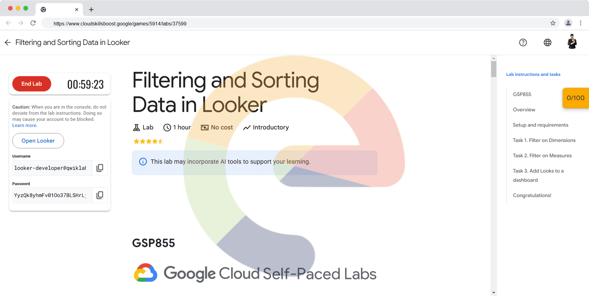
Filtering and Sorting Data in Looker - GSP855
A passionate full-stack developer from @ePlus.DEV
Overview
In this lab, you learn how to use Looker to query sorted and filtered data, create Looks, and add them to a Dashboard. For this lab, an Explore of the Federal Aviation Administration's (FAA) Airport data has been created for you. This dataset contains information on different attributes of airports such as city, date of commission, facility type, etc.
You can learn more about creating Explores from the Exploring data in Looker documentation.
What you'll learn
In this lab, you learn how to:
Use filters to select desired data from Dimensions and Measures
Create table visualizations on sorted and filtered data
Save Explore queries as Looks
Add Looks to a dashboard
Setup and requirements
Before you click the Start Lab button
Read these instructions. Labs are timed and you cannot pause them. The timer, which starts when you click Start Lab, shows how long Google Cloud resources are made available to you.
This hands-on lab lets you do the lab activities yourself in a real cloud environment, not in a simulation or demo environment. It does so by giving you new, temporary credentials that you use to sign in and access Google Cloud for the duration of the lab.
To complete this lab, you need:
- Access to a standard internet browser (Chrome browser recommended).
Note: Use an Incognito or private browser window to run this lab. This prevents conflicts between your personal account and the Student account, which may cause extra charges incurred to your personal account.
- Time to complete the lab—remember, once you start, you cannot pause a lab.
Note: If you already have a personal Google Cloud account or project, do not use it for this lab to avoid extra charges to your account.
How to start your lab and sign in to Looker
When ready, click Start Lab.
The Lab Details pane appears with the temporary credentials that you must use for this lab.
If you need to pay for the lab, a pop-up opens for you to select your payment method.
Notice your lab credentials in the Lab details pane. You use them to sign in to the Looker instance for this lab.
Note: If you use other credentials, you will get errors or incur charges.
Click Open Looker.
Enter the provided Username and Password in the Email and Password fields.
Username:
looker-developer@qwiklabs.netCopied!content_copy
Password:
YyzQk8yhmFv01Oo37BLSHrLjW4Iparf49u9KUFmqPck=Copied!content_copy
Important: You must use the credentials from the Lab Details pane on this page. Do not use your Google Cloud Skills Boost credentials. If you have a personal Looker account, do not use it for this lab.
Click Log In.
After a successful login, you see the Looker instance for this lab.
Task 1. Filter on Dimensions
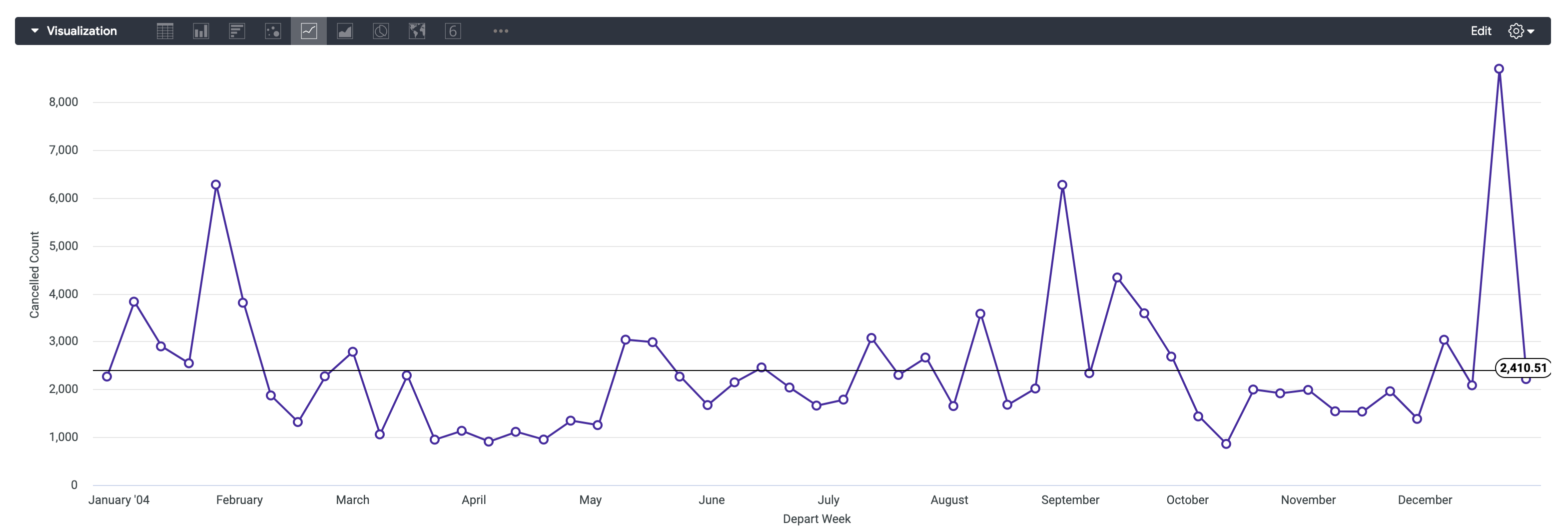
In this section, you will find the number of flights that were cancelled each week in the year 2004 and display the resulting data points in a line chart.
In the Looker navigation menu, click Explore.
Under FAA, click Flights.
Under Flight Details > Measures, click Cancelled Count.
Under Flights > Dimensions > Depart Date, click Week.
Within the Depart Date dimension group, click on the Filter button next to the Date dimension.
In the filter window, set the Depart Date filter to:
is in the year 2004.Click Run.
Click the arrow next to Visualization to expand the window.
Once the Visualization window has expanded, you can hover your cursor over the icons to identify the available options.
Change visualization type to Line.
Click on the settings gear icon for Visualization.
Click Edit > Series.
Under Colors > Collection, select your choice of theme/color.
Under Point Style, click on Outline.
Navigate to the Y menu of the visualization setting pane, scroll down to the bottom, and click on the Add Reference Line button. Ensure that the type is set to “Line” and that the value is set to “Average (Mean)”.
Click on the gear icon for Visualization to close the settings.
Click on the settings gear icon next to Run, and select Save > As a Look.
Title the Look Cancelled Flight Count by Week in 2004.
Click Save.
Click Check my progress to verify the objective.
Create your first Look.
Check my progress
Task 2. Filter on Measures
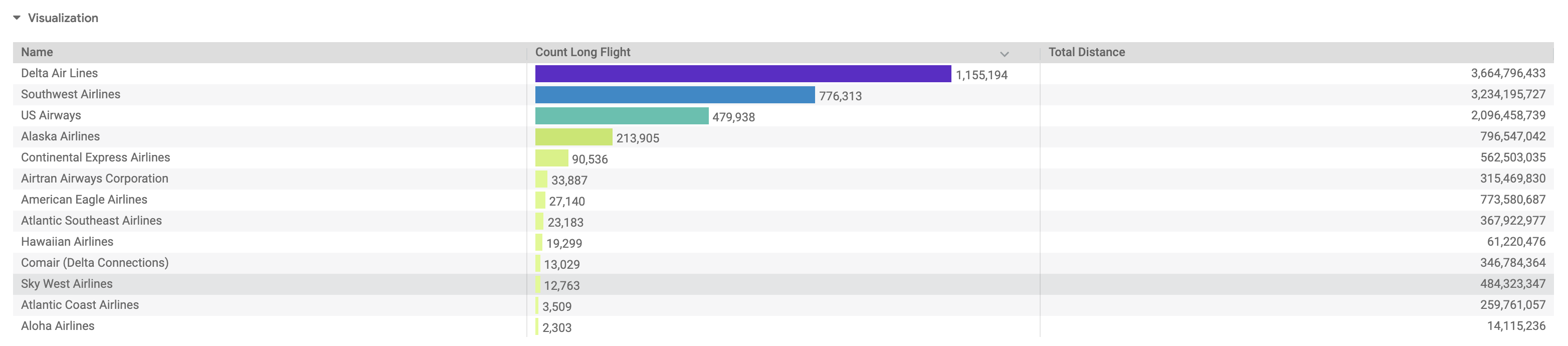
In this section, you will create a table visualization that shows the Count of Long Flights and the Total Distance flown by Carrier, but only for Carriers with a Percentage of Long Flights <= 25%.
In the Looker navigation menu, click Explore.
Under FAA, click Flights.
Under Flights > Measures, click Count Long Flight.
Under Flights > Measures, click Total Distance.
Under Carriers > Dimensions, click Name.
Under Flights > Measures, click on the Filter button next to the Percentage Long Flights measure.
In the filter window, set the filter to:
is less than or equal to .25.Click Run.
Click the arrow next to Visualization to expand the window.
Once the Visualization window has expanded, you can hover your cursor over the icons to identify the available options.
Change visualization type to Table.
Click on the settings gear icon for Visualization.
Click Edit > Plot.
Select “Gray” for the Table Theme.
Toggle Show Row Numbers off.
Click on the gear icon for Visualization to close the settings.
Click on the settings gear icon next to Run, and select Save > As a Look.
Title the Look Total Distance and Long Flight Count by Carrier.
Click Save.
Click Check my progress to verify the objective.
Create your second Look.
Check my progress
Task 3. Add Looks to a dashboard
In this section, you will add your newly created Looks to a Dashboard and visualize them side-by-side.
In the Looker navigation menu, click Folders.
Select My folder.
You should see the Looks you just created.
Click the
Cancelled Flight Count by Week in 2004Look.Click on the settings gear icon next to Run, and select Save > To an existing dashboard.
Click New Dashboard.
Enter a title for the new dashboard: Flights Data.
Click Add Look to Dashboard.
You will now repeat the same process for the second Look you created.
Navigate back to Folders > My folder.
Click the
Total Distance and Long Flight Count by CarrierLook.Click on the settings gear icon next to Run, and select Save > To an existing dashboard.
Select the dashboard you previously created: Flights Data.
Click Add Look to Dashboard.
Now that you've added both Looks to your new dashboard, you can view it.
Navigate back to Folders > My folder.
Under Dashboards, select Flights Data.
Now you can play around with your interactive Looks inside of your newly created Dashboard!
Click Check my progress to verify the objective.
Add Looks to a Dashboard.
Solution of Lab
✅ Task 1 – Filter on Dimensions
Goal: Create a Look showing the number of cancelled flights each week in 2004 as a line chart.
From the Looker navigation menu, click Explore.
Under FAA, click Flights.
In the Field Picker (left panel):
Under Flight Details > Measures, select ✅ Cancelled Count.
Under Flights > Dimensions > Depart Date, select ✅ Week.
Still under Depart Date, click the Filter icon next to Date.
In the filter options:
- Set Depart Date to is in the year 2004.
Click Run to execute the query.
📈 Visualization:
Expand the Visualization pane (arrow next to Visualization).
Change visualization type to Line.
Click the ⚙️ gear icon → Edit > Series:
Under Colors > Collection, choose a color theme.
Under Point Style, select Outline.
Go to the Y tab:
Scroll to the bottom and click Add Reference Line.
Set Type:
LineSet Value:
Average (Mean)
Click the gear icon again to close the settings panel.
💾 Save the Look:
Click the gear icon next to Run → Save > As a Look.
Title:
Cancelled Flight Count by Week in 2004Click Save.
✅ Result: A line chart showing weekly cancelled flights in 2004 with an average reference line.

✅ Task 2 – Filter on Measures
Goal: Create a table showing long flight count and total distance by carrier, filtered by percentage of long flights ≤ 25%.
From the navigation menu, click Explore.
Under FAA, click Flights.
In the Field Picker:
Under Flights > Measures, select ✅ Count Long Flight.
Under Flights > Measures, select ✅ Total Distance.
Under Carriers > Dimensions, select ✅ Name.
Under Flights > Measures, click the Filter icon next to Percentage Long Flights.
Set the filter to: is less than or equal to 0.25.
Click Run.
📊 Visualization:
Expand the Visualization pane.
Change visualization type to Table.
Click the ⚙️ gear icon → Edit > Plot:
Table Theme:
GrayToggle Show Row Numbers → Off
Close the settings panel.
💾 Save the Look:
Click the gear icon next to Run → Save > As a Look.
Title:
Total Distance and Long Flight Count by CarrierClick Save.
✅ Result: A table showing carriers, total distance, and count of long flights where the percentage of long flights ≤ 25%.

✅ Task 3 – Add Looks to a Dashboard
Goal: Combine the two Looks you created into a single interactive dashboard.
📁 Add the First Look:
Go to Folders > My folder.
Click on the Look Cancelled Flight Count by Week in 2004.
Click the gear icon next to Run → Save > To an existing dashboard.
Click New Dashboard.
Enter the dashboard title:
Flights Data.Click Add Look to Dashboard.
📁 Add the Second Look:
Go back to Folders > My folder.
Click the Look Total Distance and Long Flight Count by Carrier.
Click the gear icon → Save > To an existing dashboard.
Choose the existing dashboard:
Flights Data.Click Add Look to Dashboard.
📊 View the Dashboard:
Navigate to Folders > My folder > Dashboards.
Click Flights Data.
✅ Result: A dashboard containing:
A line chart of cancelled flights per week (2004).
A table of long flight counts and total distance per carrier.