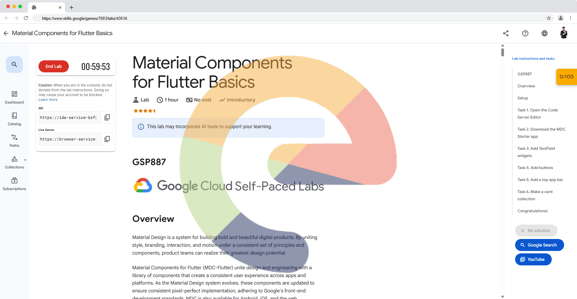
Material Components for Flutter Basics - GSP887
A passionate full-stack developer from @ePlus.DEV
Overview
Material Design is a system for building bold and beautiful digital products. By uniting style, branding, interaction, and motion under a consistent set of principles and components, product teams can realize their greatest design potential.
Material Components for Flutter (MDC-Flutter) unite design and engineering with a library of components that create a consistent user experience across apps and platforms. As the Material Design system evolves, these components are updated to ensure consistent pixel-perfect implementation, adhering to Google's front-end development standards. MDC is also available for Android, iOS, and the web.
What you'll build
This lab will guide you through building an app called Shrine, an e-commerce app that sells clothing and home goods. It will demonstrate how you can customize components to reflect any brand or style using MDC-Flutter.
In this lab, you'll build a login page for Shrine that contains:
An image of Shrine's logo
The name of the app (Shrine)
Two text fields, one for entering a username and the other for a password
Two buttons
Setup
Before you click the Start Lab button
Read these instructions. Labs are timed and you cannot pause them. The timer, which starts when you click Start Lab, shows how long Google Cloud resources are made available to you.
This hands-on lab lets you do the lab activities in a real cloud environment, not in a simulation or demo environment. It does so by giving you new, temporary credentials you use to sign in and access Google Cloud for the duration of the lab.
To complete this lab, you need:
- Access to a standard internet browser (Chrome browser recommended).
Note: Use an Incognito (recommended) or private browser window to run this lab. This prevents conflicts between your personal account and the student account, which may cause extra charges incurred to your personal account.
- Time to complete the lab—remember, once you start, you cannot pause a lab.
Note: Use only the student account for this lab. If you use a different Google Cloud account, you may incur charges to that account.
Task 1. Open the Code Server Editor
In this lab, you will use a custom editor that includes the Flutter and Dart extensions. From the initial Qwiklabs panel:
- From the Lab Details panel copy the
IDElink:
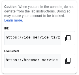
- Paste the link into a browser.
Note: Code Server Editor
Based on VS Code
Supports Extensions
Task 2. Download the MDC Starter app
Clone the starter app from GitHub
In this section clone the material components starter app repository.
- From the main panel select the
ExplorerIcon.
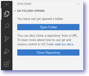
Select the Clone Repository option.
Paste the following repository name:
https://github.com/material-components/material-components-flutter-codelabs.git
Click Clone from URL.
Set the destination folder as below and click OK.
/home/ide-dev/
You can safely ignore any pop-ups in your editor (including opening the folder).
Click Open Folder from the Explorer panel and navigate to the folder
/home/ide-dev/material-components-flutter-codelabs/mdc_100_series. Click OK.Confirm the notifications to get packages
Create a web build
The material components starter app is designed to be run and tested as a mobile app. Use the editor to quickly create a web build which you can use for rapid testing.
In the editor, open a new Terminal by clicking the Application Menu > Terminal > New Terminal. You can also press ctrl + shift + ` to open a new Terminal.
Ensure you are working from the material-components-flutter-codelabs directory:
cd ~/material-components-flutter-codelabs/mdc_100_series
- Enable web for your flutter project:
flutter config --enable-web
- Re-create the flutter project with web now enabled:
flutter create .
You'll now see a web folder appear in your mdc_100_series directory. Flutter has added the files necessary to build and test this application on the web.
Run the Starter app
To run the web application start the server and then use the Live Server to view the result.
- Run the Flutter web server from the terminal:
fwr
The running web server should look similar to below:

- Copy the Live Server address from the Qwiklabs Panel and paste it into a new browser tab.
- The browser will render the web application!
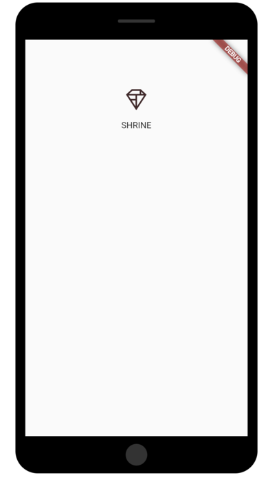
- Return to your Code Server IDE tab and inspect the code.
Note: The web application might take some time to display the SHRINE Icon.
Click Check my progress to verify the objective.
Clone the repository, re-create the flutter project and run the starter app
Widgets in login.dart
If you haven't already, expand the mdc_100_series and lib folders in your Code Server explorer.
Open up
lib/login.dart.
Notice that it contains:
An
importstatement that brings Material Components into this file.A
LoginPagepublic class that represents the entire page displayed in the simulator.A
_LoginPageStateprivate class that includes abuild()function to control the UI widgets.
Task 3. Add TextField widgets
To begin, you'll add two text fields to your login page, where users enter their username and password. You'll use the TextField widget, which displays a floating label and activates a touch ripple.
Note: Material's text fields have been greatly enhanced to improve brand flexibility, with improvements backed by extensive user experience (UX) research for better usability and visual design.
Learn more about the new text fields in their Material Guidelines article.
This page is structured primarily with a ListView, which arranges its children in a scrollable column. Let's place text fields at the bottom.
- In
lib/login.dart, add two new text fields and a spacer by replacing line 45,// TODO: Add TextField widgets (101), with this snippet:
            // TODO: Add TextField widgets (101)
            // [Name]
            TextField(
              decoration: InputDecoration(
                filled: true,
                labelText: 'Username',
              ),
            ),
            // spacer
            const SizedBox(height: 12.0),
            // [Password]
            TextField(
              decoration: InputDecoration(
                filled: true,
                labelText: 'Password',
              ),
              obscureText: true,
            ),
The text fields each have a decoration: field that takes an InputDecoration widget.
The filled: field means the background of the text field is lightly filled in to help people recognize the tap or touch target area of the text field.
The second text field's obscureText: true value automatically replaces the input that the user types with bullets, which is appropriate for passwords.
Save your changes to
lib/login.dart.In your Code Server terminal, press the
rkey to perform a hot reload.Return to the tab displaying your web app and refresh it.
You should now see a page with two text fields for Username and Password! Check out the floating label animation.
Note: TextField features include:
The TextField widget's look can be easily changed. For the decoration field, specify an InputDecoration value.
The MDC text field displays touch feedback (called the MDC ripple or "ink") by default.
The FormField is a similar widget that has special features for embedding fields in Forms.
Note: The application might take some time to load text fields for Username and Password.
Click Check my progress to verify the objective.
Add TextField widgets in the lib/login.dart
Task 4. Add buttons
Next, you'll add two buttons to your login page: "Cancel" and "Next." You'll use two kinds of MDC button widgets:
TextButton
ElevatedButton
Note: Why not simply display two contained buttons? Each button type indicates which actions are more important than others.
A layout should contain a single prominent button. This makes it clear that other buttons have less importance. This prominent button represents the action we most want our users to take in order to advance through our app.
The action we'd least like them to take is canceling the login. Because a contained button draws the eye with its raised appearance, it should be used for the more important action. By comparison, the plain text button to the left of it looks less emphasized.
Learn more about button hierarchy in the Buttons article of the Material Guidelines.
Add the OverflowBar
In lib/login.dart:
- Add the OverflowBar to the ListView's children by replacing
// TODO: Add button bar (101)with this code:
  // TODO: Add button bar (101)
  OverflowBar(
    alignment: MainAxisAlignment.end,
    // TODO: Add a beveled rectangular border to CANCEL (103)
    children: <Widget>[
      // TODO: Add buttons (101)
    ],
  ),
The OverflowBar arranges its children in a row.
Add the buttons
Then add two buttons to the OverflowBar's list of children:
  // TODO: Add buttons (101)
    TextButton(
      child: const Text('CANCEL'),
      onPressed: () {
        // TODO: Clear the text fields (101)
      },
    ),
    // TODO: Add an elevation to NEXT (103)
    // TODO: Add a beveled rectangular border to NEXT (103)
    ElevatedButton(
      child: const Text('NEXT'),
      onPressed: () {
    // TODO: Show the next page (101)
      },
    ),
Note: Why are there empty blocks for the onPressed: fields?
If you passed null, or didn't include the field (which then defaults to null), the buttons would become disabled. There would be no feedback on touch and you couldn't get a good idea of their enabled behavior. Using empty blocks prevents them from being disabled.
For more information on buttons and their interactions, refer to Adding Interactivity to Your App.
Save your
lib/login.dartfile.Hot reload your app by pressing the
rkey in the Coder Server terminal. And, return to the tab displaying your application.
You should see two buttons appear: Cancel and Next.
The OverflowBar handles the layout work for you. It positions the buttons horizontally, so they appear next to one another.
Touching a button initiates an ink ripple animation, without causing anything else to happen. Let's add functionality into the anonymous onPressed: functions, so that the cancel button clears the text fields, and the next button dismisses the screen:
Add TextEditingControllers
To make it possible to clear the text fields' values, you'll add TextEditingControllers to control their text.
- Right under the
_LoginPageStateclass's declaration inlogin.dart, find the// TODO: Add text editing controllers (101). Replace it to add the controllers as final variables:
  // TODO: Add text editing controllers (101)
  final _usernameController = TextEditingController();
  final _passwordController = TextEditingController();
- Locate the first TextField you added with the
// [Name]comment. Add acontroller:field and set it to the_usernameController:
// [Name]
TextField(
  controller: _usernameController,
- Find the next TextField with the
// [Password]comment. Add acontroller:field and set it to the_passwordController:
// [Password]
TextField(
  controller: _passwordController,
Edit onPressed
- In the
CANCELonPressed function, replace// TODO: Clear the text fields (101)with a command to clear to each controller:
    // TODO: Clear the text fields (101)
    _usernameController.clear();
    _passwordController.clear();
- Save
login.dart.Now when you type something into the text fields, hitting cancel clears each field again.
This login form is in good shape! Next, you will advance your users to the rest of the Shrine app.
Pop
To dismiss this view, you want to pop (or remove) this page (which Flutter calls a route) off the navigation stack.
- In the ElevatedButton's
NEXTonPressed: function, pop the most recent route from the Navigator by replacing// TODO: Show the next page (101)with this:
        // TODO: Show the next page (101)
        Navigator.pop(context);
Save your login.dart file.
Lastly, open up
home.dartand set resizeToAvoidBottomInset to false in the Scaffold.Replace the
return const Scaffoldsection of the code (lines 24-31) with this snippet:
    return Scaffold(
      // TODO: Add app bar (102)
      // TODO: Add a grid view (102)
      body: Center(
        child: Text('You did it!'),
      ),
      // TODO: Set resizeToAvoidBottomInset (101)
      resizeToAvoidBottomInset: false,
    );
Note: If you get an error Cannot invoke a non- 'const' constructor, in app.dart file, remove const from return MaterialPageRoute code block. So it can look like builder: (BuildContext context) => LoginPage(),
Doing this ensures that the keyboard's appearance does not alter the size of the home page or its widgets.
That's it!
Save the
home.dart.Perform a hot reload in your Code Server terminal and view the app in your browser.
Try out the Next button. You should receive the message below in the application.
"You did it!"
Note: About buttons
In addition to FlatButton and RaisedButton, there's OutlineButton, FloatingActionButton, IconButton, and more.
Browse buttons and their documentation in the MDC Widgets catalog.
Click Check my progress to verify the objective.
Add buttons in the lib/login.dart and replace the section of the code in the home.dart file
Task 5. Add a top app bar
Right now, if you click the "Next" button you will be able to see the home screen that says "You did it!". That's great! But now the user has no actions to take, or any sense of where they are in the app. To help with that, it's time to add navigation.
Note: Navigation refers to the components, interactions, visual cues, and information architecture that enable users to move through an app. It helps make content and features discoverable, so that tasks are easy to complete.
Learn more in the Navigation article in the Material Guidelines.
Material Design offers navigation patterns that ensure a high degree of usability. One of the most visible components is a top app bar.
Note: You may know the top app bar as a "Navigation Bar" in iOS, or as simply an "App Bar" or "Header."
To provide navigation and give users quick access to other actions, you will add a top app bar.
Add an AppBar widget
Adding the AppBar to the Scaffold's appBar: field, gives you a perfect layout for free, keeping the AppBar at the top of the page and the body underneath.
Note: Scaffold is an important widget in MaterialApps. It provides convenient APIs for displaying all sorts or common Material Components like drawers, snack bars, and bottom sheets. It can even help layout a Floating Action Button.
Learn more about Scaffold in its Flutter documentation.
- In
home.dart, add an AppBar to the Scaffold. Replace the// TODO: Add app bar (102)line with this code:
  // TODO: Add app bar (102)
  appBar: AppBar(
    // TODO: Add buttons and title (102)
  ),
Save
home.dartand hot reload your app by pressing therkey in your Code Server terminal.Refresh your app and click Next to see the home screen.
AppBar looks great but it needs a title.
Add a text widget
- In
home.dart, add a title to the AppBar:
// TODO: Add app bar (102)
  appBar: AppBar(
    // TODO: Add buttons and title (102)
    title: Text('SHRINE'),
    // TODO: Add trailing buttons (102)
  ),
- Save
home.dart, perform a hot reload, and refresh your web app page to view the title.
Many app bars have a button next to the title. In the next section, you will add a menu icon to the app.
Add a leading IconButton
Note: The IconButton class is a convenient way to incorporate Material Icons in your app. It takes an Icon widget. Flutter has a whole collection of icons in the Icons class. It automatically imports the icons based on a mapping of const strings.
Learn more about the Icons class in its Flutter documentation. And learn more about the Icon widget in its Flutter documentation.
You can also add buttons to the trailing side of the title. In Flutter, these are called "actions".
Note: Leading and trailing are terms that express direction, referring to the beginning and ending of text lines in a language-agnostic way. When working in an LTR (left-to-right) language like English, leading means left and trailing means right. In an RTL (right-to-left) language like Arabic, leading means right and trailing means left.
For more information on UI Mirroring, see the Material Design guidelines on Bidirectionality.
- While still in
home.dart, set an IconButton for the AppBar's leading: field. Replace the// TODO: Add buttons and title (102)line with this code:
    // TODO: Add buttons and title (102)
    leading: IconButton(
      icon: Icon(
        Icons.menu,
        semanticLabel: 'menu',
      ),
      onPressed: () {
        print('Menu button');
      },
    ),
The IconButton is placed before the title: field to mimic the leading-to-trailing order.
- Save
home.dart, perform a hot reload, and refresh your web app page to view the menu.
The menu icon (also known as the "hamburger") shows up right where you'd expect it.
Add actions
There's room for two more IconButtons.
- Add them to the AppBar instance after the title. Replace
// TODO: Add trailing buttons (102):
// TODO: Add trailing buttons (102)
actions: <Widget>[
  IconButton(
    icon: Icon(
      Icons.search,
      semanticLabel: 'search',
    ),
    onPressed: () {
      print('Search button');
    },
  ),
  IconButton(
    icon: Icon(
      Icons.tune,
      semanticLabel: 'filter',
    ),
    onPressed: () {
      print('Filter button');
    },
  ),
],
- Save your
home.dartfile, perform a hot reload in your Cloud Server terminal, and refresh your web app page.
Your home screen should reflect the changes.
Now the app has a leading button, a title, and two actions on the right side. The app bar also displays elevation using a subtle shadow that shows it's on a different layer than the content.
Click Check my progress to verify the objective.
Add a top app bar
Task 6. Make a card collection
Whenever multiple cards are present in a screen, they are grouped together into one or more collections. Cards in a collection are coplanar, meaning cards share the same resting elevation as one another (unless the cards are picked up or dragged, but that won't be covered within this lab).
Multiply the card into a collection
- Make a new private function above the build() function (remember that functions starting with an underscore are private API). Replace
// TODO: Make a collection of cards (102)with this code:
// TODO: Make a collection of cards (102)
List<Card> _buildGridCards(int count) {
  List<Card> cards = List.generate(
    count,
    (int index) => Card(
      clipBehavior: Clip.antiAlias,
      child: Column(
        crossAxisAlignment: CrossAxisAlignment.start,
        children: <Widget>[
          AspectRatio(
            aspectRatio: 18.0 / 11.0,
            child: Image.asset('assets/diamond.png'),
          ),
          Padding(
            padding: EdgeInsets.fromLTRB(16.0, 12.0, 16.0, 8.0),
            child: Column(
              crossAxisAlignment: CrossAxisAlignment.start,
              children: <Widget>[
                Text('Title'),
                SizedBox(height: 8.0),
                Text('Secondary Text'),
              ],
            ),
          ),
        ],
      ),
    ),
  );

  return cards;
}
- Assign the generated cards to GridView's children field. Remember to replace everything contained in the body with this new code:
// TODO: Add a grid view (102)
body: GridView.count(
  crossAxisCount: 2,
  padding: EdgeInsets.all(16.0),
  childAspectRatio: 8.0 / 9.0,
  children: _buildGridCards(10) // Replace
),
- Save
home.dart, perform a hot reload, and refresh your web app browser.
The cards are there, but they don't show anything yet. Now's the time to add some product data.
Let's unpack that code. The GridView invokes the count() constructor since the number of items it displays is countable and not infinite. But it needs some information to define its layout.
The crossAxisCount: specifies how many items across. We want 2 columns.
Cross axis in Flutter means the non-scrolling axis. The scrolling direction is called the main axis. So, if you have vertical scrolling, like GridView does by default, then the cross axis is horizontal. Learn more in Build Layouts.
The padding: field provides space on all 4 sides of the GridView. Of course you can't see the padding on the trailing or bottom sides because there's no GridView children next to them yet.
The childAspectRatio: field identifies the size of the items based on an aspect ratio (width over height).
By default, GridView makes tiles that are all the same size.
We have one card but it's empty. Let's add child widgets to our card.
- Cards should have regions for an image, a title, and secondary text.
Update the children of the GridView:
  children: <Widget>[
    Card(
      clipBehavior: Clip.antiAlias,
      child: Column(
        crossAxisAlignment: CrossAxisAlignment.start,
        children: <Widget>[
          AspectRatio(
            aspectRatio: 18.0 / 11.0,
            child: Image.asset('assets/diamond.png'),
          ),
          Padding(
            padding: const EdgeInsets.fromLTRB(16.0, 12.0, 16.0, 8.0),
            child: Column(
              crossAxisAlignment: CrossAxisAlignment.start,
              children: <Widget>[
                Text('Title'),
                const SizedBox(height: 8.0),
                Text('Secondary Text'),
              ],
            ),
          ),
        ],
      ),
    )
  ],
Add product data
The app has some products with images, names, and prices. You'll add that to the widgets you have in the card already.
- In
home.dart, import a new package and some files supplied within the GitHub repo for a data model:
import 'package:intl/intl.dart';
import 'model/products_repository.dart';
import 'model/product.dart';
- Update _buildGridCards() to fetch the product info, and use that data in the cards:
// TODO: Make a collection of cards (102)

// Replace this entire method
List<Card> _buildGridCards(BuildContext context) {
  List<Product> products = ProductsRepository.loadProducts(Category.all);

  if (products == null || products.isEmpty) {
    return const <Card>[];
  }

  final ThemeData theme = Theme.of(context);
  final NumberFormat formatter = NumberFormat.simpleCurrency(
      locale: Localizations.localeOf(context).toString());

  return products.map((product) {
    return Card(
      clipBehavior: Clip.antiAlias,
      // TODO: Adjust card heights (103)
      child: Column(
        // TODO: Center items on the card (103)
        crossAxisAlignment: CrossAxisAlignment.start,
        children: <Widget>[
          AspectRatio(
            aspectRatio: 18 / 11,
            child: Image.asset(
              product.assetName,
              package: product.assetPackage,
             // TODO: Adjust the box size (102)
             fit: BoxFit.fitWidth,
            ),
          ),
          Expanded(
            child: Padding(
              padding: EdgeInsets.fromLTRB(16.0, 12.0, 16.0, 8.0),
              child: Column(
               // TODO: Align labels to the bottom and center (103)
               crossAxisAlignment: CrossAxisAlignment.start,
                // TODO: Change innermost Column (103)
                children: <Widget>[
                 // TODO: Handle overflowing labels (103)
                 Text(
                    product.name,
                    style: theme.textTheme.headline6,
                    maxLines: 1,
                  ),
                  SizedBox(height: 8.0),
                  Text(
                    formatter.format(product.price),
                    style: theme.textTheme.subtitle2,
                  ),
                ],
              ),
            ),
          ),
        ],
      ),
    );
  }).toList();
}
- Change the build() function to pass the BuildContext to _buildGridCards() before you try to compile:
// TODO: Add a grid view (102)
body: GridView.count(
  crossAxisCount: 2,
  padding: EdgeInsets.all(16.0),
  childAspectRatio: 8.0 / 9.0,
  children: _buildGridCards(context) // Changed code
),
- Save
home.dart, perform a hot reload, and refresh your web app browser.
The products are now showing up in the app perfectly!
Click Check my progress to verify the objective.
Make a collection of cards
Solution of Lab
Task 1:
git clone https://github.com/material-components/material-components-flutter-codelabs.git /home/ide-dev
cd ~/material-components-flutter-codelabs/mdc_100_series
flutter config --enable-web
flutter create .
fwr


Login.Dart
// Copyright 2018-present the Flutter authors. All Rights Reserved.
//
// Licensed under the Apache License, Version 2.0 (the "License");
// you may not use this file except in compliance with the License.
// You may obtain a copy of the License at
//
// http://www.apache.org/licenses/LICENSE-2.0
//
// Unless required by applicable law or agreed to in writing, software
// distributed under the License is distributed on an "AS IS" BASIS,
// WITHOUT WARRANTIES OR CONDITIONS OF ANY KIND, either express or implied.
// See the License for the specific language governing permissions and
// limitations under the License.

import 'package:flutter/material.dart';

class LoginPage extends StatefulWidget {
  const LoginPage({Key? key}) : super(key: key);

  @override
  _LoginPageState createState() => _LoginPageState();
}

class _LoginPageState extends State<LoginPage> {
  // TODO: Add text editing controllers (101)
   // TODO: Add text editing controllers (101)
  final _usernameController = TextEditingController();
  final _passwordController = TextEditingController();
  @override
  Widget build(BuildContext context) {
    return Scaffold(
      body: SafeArea(
        child: ListView(
          padding: const EdgeInsets.symmetric(horizontal: 24.0),
          children: <Widget>[
            const SizedBox(height: 80.0),
            Column(
              children: <Widget>[
                Image.asset('assets/diamond.png'),
                const SizedBox(height: 16.0),
                const Text('SHRINE'),
              ],
            ),
            const SizedBox(height: 120.0),
            // TODO: Remove filled: true values (103)
            // TODO: Add TextField widgets (101)
            // [Name]
            TextField(
              controller: _usernameController,
              decoration: InputDecoration(
                filled: true,
                labelText: 'Username',
              ),
            ),
            // spacer
            const SizedBox(height: 12.0),
            // [Password]
            TextField(
               controller: _passwordController,
              decoration: InputDecoration(
                filled: true,
                labelText: 'Password',
              ),
              obscureText: true,
            ),

            // TODO: Add button bar (101)
  // TODO: Add button bar (101)
  OverflowBar(
    alignment: MainAxisAlignment.end,
    // TODO: Add a beveled rectangular border to CANCEL (103)
    children: <Widget>[
      // TODO: Add buttons (101)
    ],
  ),

   // TODO: Add buttons (101)
    TextButton(
      child: const Text('CANCEL'),
      onPressed: () {
        // TODO: Clear the text fields (101)
        _usernameController.clear();
        _passwordController.clear();
      },
    ),
    // TODO: Add an elevation to NEXT (103)
    // TODO: Add a beveled rectangular border to NEXT (103)
    ElevatedButton(
      child: const Text('NEXT'),
      onPressed: () {
    // TODO: Show the next page (101)
    Navigator.pop(context);
      },
    ),


          ],
        ),
      ),
    );
  }
}
Home.Dart
// Copyright 2018-present the Flutter authors. All Rights Reserved.
//
// Licensed under the Apache License, Version 2.0 (the "License");
// you may not use this file except in compliance with the License.
// You may obtain a copy of the License at
//
// http://www.apache.org/licenses/LICENSE-2.0
//
// Unless required by applicable law or agreed to in writing, software
// distributed under the License is distributed on an "AS IS" BASIS,
// WITHOUT WARRANTIES OR CONDITIONS OF ANY KIND, either express or implied.
// See the License for the specific language governing permissions and
// limitations under the License.

import 'package:flutter/material.dart';
import 'package:intl/intl.dart';
import 'model/products_repository.dart';
import 'model/product.dart';

class HomePage extends StatelessWidget {
  const HomePage({Key? key}) : super(key: key);

  // TODO: Make a collection of cards (102)
  // TODO: Make a collection of cards (102)

// Replace this entire method
List<Card> _buildGridCards(BuildContext context) {
  List<Product> products = ProductsRepository.loadProducts(Category.all);

  if (products == null || products.isEmpty) {
    return const <Card>[];
  }

  final ThemeData theme = Theme.of(context);
  final NumberFormat formatter = NumberFormat.simpleCurrency(
      locale: Localizations.localeOf(context).toString());

  return products.map((product) {
    return Card(
      clipBehavior: Clip.antiAlias,
      // TODO: Adjust card heights (103)
      child: Column(
        // TODO: Center items on the card (103)
        crossAxisAlignment: CrossAxisAlignment.start,
        children: <Widget>[
          AspectRatio(
            aspectRatio: 18 / 11,
            child: Image.asset(
              product.assetName,
              package: product.assetPackage,
             // TODO: Adjust the box size (102)
             fit: BoxFit.fitWidth,
            ),
          ),
          Expanded(
            child: Padding(
              padding: EdgeInsets.fromLTRB(16.0, 12.0, 16.0, 8.0),
              child: Column(
               // TODO: Align labels to the bottom and center (103)
               crossAxisAlignment: CrossAxisAlignment.start,
                // TODO: Change innermost Column (103)
                children: <Widget>[
                 // TODO: Handle overflowing labels (103)
                 Text(
                    product.name,
                    style: theme.textTheme.headline6,
                    maxLines: 1,
                  ),
                  SizedBox(height: 8.0),
                  Text(
                    formatter.format(product.price),
                    style: theme.textTheme.subtitle2,
                  ),
                ],
              ),
            ),
          ),
        ],
      ),
    );
  }).toList();
}
  // TODO: Make a collection of cards (102)
  List<Card> _buildGridCards(int count) {
    List<Card> cards = List.generate(
      count,
      (int index) => Card(
        clipBehavior: Clip.antiAlias,
        child: Column(
          crossAxisAlignment: CrossAxisAlignment.start,
  children: <Widget>[
    Card(
      clipBehavior: Clip.antiAlias,
      child: Column(
        crossAxisAlignment: CrossAxisAlignment.start,
        children: <Widget>[
          AspectRatio(
            aspectRatio: 18.0 / 11.0,
            child: Image.asset('assets/diamond.png'),
          ),
          Padding(
            padding: const EdgeInsets.fromLTRB(16.0, 12.0, 16.0, 8.0),
            child: Column(
              crossAxisAlignment: CrossAxisAlignment.start,
              children: <Widget>[
                Text('Title'),
                const SizedBox(height: 8.0),
                Text('Secondary Text'),
              ],
            ),
          ),
        ],
      ),
    )
  ],
        ),
      ),
    );

    return cards;
  }

  // TODO: Add a variable for Category (104)
  @override
  Widget build(BuildContext context) {
    // TODO: Return an AsymmetricView (104)
    return Scaffold(
      // TODO: Add app bar (102)
      // TODO: Add app bar (102)
      appBar: AppBar(
        // TODO: Add buttons and title (102)
        // TODO: Add buttons and title (102)
        leading: IconButton(
          icon: Icon(
            Icons.menu,
            semanticLabel: 'menu',
          ),
          onPressed: () {
            print('Menu button');
          },
        ),
        title: Text('SHRINE'),
        // TODO: Add trailing buttons (102)
        // TODO: Add trailing buttons (102)
        actions: <Widget>[
          IconButton(
            icon: Icon(
              Icons.search,
              semanticLabel: 'search',
            ),
            onPressed: () {
              print('Search button');
            },
          ),
          IconButton(
            icon: Icon(
              Icons.tune,
              semanticLabel: 'filter',
            ),
            onPressed: () {
              print('Filter button');
            },
          ),
        ],
      ),
      // TODO: Add a grid view (102)
      // TODO: Add a grid view (102)
body: GridView.count(
  crossAxisCount: 2,
  padding: EdgeInsets.all(16.0),
  childAspectRatio: 8.0 / 9.0,
  children: _buildGridCards(context) // Changed code
),
// TODO: Add a grid view (102)
      body: GridView.count(
          crossAxisCount: 2,
          padding: EdgeInsets.all(16.0),
          childAspectRatio: 8.0 / 9.0,
          children: _buildGridCards(10) // Replace
          ),
      // TODO: Set resizeToAvoidBottomInset (101)
      resizeToAvoidBottomInset: false,
    );
    // TODO: Pass Category variable to AsymmetricView (104)
    return const Scaffold(
      // TODO: Add app bar (102)
      // TODO: Add a grid view (102)
      body: Center(
        child: Text('You did it!'),
      ),
      // TODO: Set resizeToAvoidBottomInset (101)
    );
  }
}